by Jonathan Lopez-Carrasco
We have been tasked to look over certain ads in order to understand how they use Principles of Design, looking at how these affect the Advertisement overall I went to find one. This was an ad that I found that had a good and unique style of text, color and design. It is made by the Soda company, ‘Dr. Pepper’ and the type of soda it released is a diet soda variety. The target dempgraphic it was aimed towards was for men, with a lumberjack type theme featuring nature, animals, and the wilderness. It was a short lived campaign and although they have been taken down, ads have been saved by a variety of sites. This particular ad can be found here:
https://drpepper2010.weebly.com/advertising-dr-pepper.html

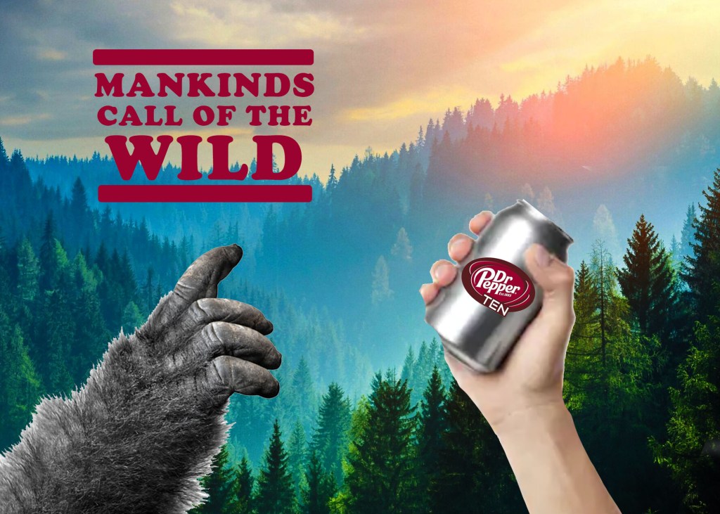
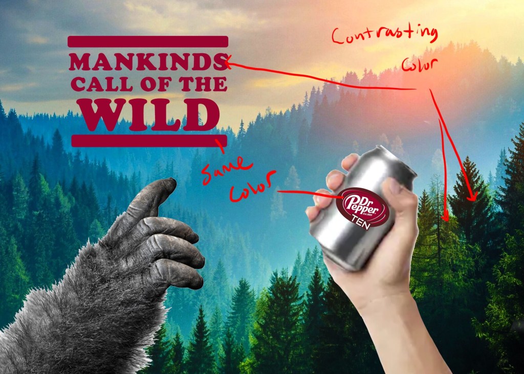
In order to understand and emulate the type of principles that are used in this ad, I decided to make my own advertisement in a similar fashion. Looking to find a similar background, I chose a forest like background. As the ad itself was leaning towards a manly like quality, and nature themed as well (seeing the great outdoors in the background) I decided to add a Bigfoot arm in my ad and luckily found a text similar to that of the original ad. Here it is below:
PRINCIPLES OF DESIGN: ORIGINAL AD
Typography
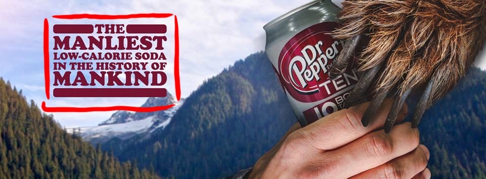
Looking into the typography used in this ad, I had to find the type of font used here. The font used is called Cooper Black. The way that the text us put together is pretty interesting, as the words that the ad wants you to focus on have their own row. The words “MANLIEST” and “MANKIND” are highlighted and want to be the focus of this ad.
Color
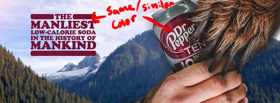
The principle of color have much to be desired in this advertisement, but it can be seen. you an see with the background and the text and logo colors, there is a principle of contrasting colors present. The color of green with the forest and the red color of the logo and the can’s logo shows that unique principle. The colors of the background are dull and don’t pop out.
Design

The design aspect of this advertisement is apparent with the rule of thirds. I tried my hand at creating the grid that goes along with the rule of thirds, that way we can see how its use helps in effective placement. The hands of both the bear and the man are in the crosslines where ones focus would be in such an ad, and so does the placement of the text. They all overlay on those key points that would grab ones attention, in doing so making this a good use of this principle of design.
PRINCIPLE OF DESIGN: NEW AD
Typography
Trying to recreate a new version of the ad, I had the liberty of making it a lot bigger. Luckily for me I was able to find the same type of text in Adobe Photoshop and use it to make a new slogan for this new ad. Being able to edit the line spacing to have the text more uniform was helpful. In order to match the style in the original ad, I was able to create rounded rectangles to make the borders seen in the text box.
Color
In the last ad, the use of contrasting colors was the only use of color. In this new ad, I was able to find a background that has a lot more color, more saturation in its background, and a wide variety of colors are found here from yellow, green and blue. I still make good use of the color of the text and logo to have some contrasting colors from the green of the forest, making this ad a lot more vibrant that the original.
Design
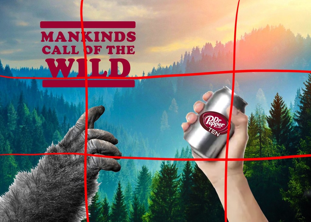
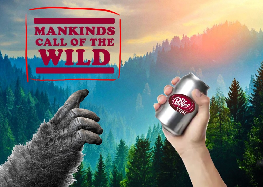
With this new ad, I wanted to align the objects of the hands and the text in key places as to follow the rule of thirds again. The grid on this image shows how it would show, as the big foot and human hand are in the bottom left and right positions to be somewhere the eyes are drawn to. The text is found at the top corner and would be where it would be another point of focus. Leaving the right side empty, the hills go down and lead the viewer to the hands and text. I would say that the principles of design used in this ad are well put together and make for a better expanded ad.
Conclusion
Having both advertisements side by side, they really do compliment each other and would make for a great campaign. The themes of the wild do show with a nice forest background and show both man and beast interested in this soda. The way the ads are put together, using good principles of design, focus the attention of the ad on the soda. The text is east on the eyes and its uniformity really comes together and really makes good on typography techniques. The use of contrasting colors of the text and the logo, against the green wilderness really go a long way. The use of these principles makes these ads very interesting and will help convey how manly this soda is.
