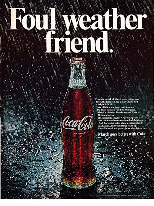
Taking a Look as this 90’s advertisement found in many magazines, Coca-Cola had a good grasp of designing an appealing ad. Lets take a look at how this page for Cola really shows good designing principles.
Alignment

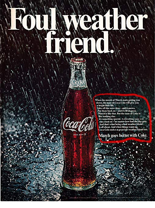
They kept the main top text aligned towards the center while having the bottle placed in the middle. With the description at the right of the bottle, the design leads you the text box. Even the direction of the rain directs your attention to the bottle.
Repetition

The repetition found in the ad would be the rain, as there are multiple drops falling in the background. The direction they are falling in leads the attention of the viewer towards the object.
Proximity

Though the dominant bold letters are found at the top of the page, as you see at the right of the bottle, the description of whats happening in this ad are found.
Contrast
You can find the theme of this ad with the big bold text at the top, and then a description at the side of the page. The dark tone of this image is very well displayed and explained, and the direction of it is well placed.
Color

This ad is a dark one with shades of black and white, with a dark background and white rain, followed by white text around it. The real Color pops out from the brown soda in the bottle, really grabbing the viewers attention!
In conclusion, this ad for Coca-Cola effectively uses design principles to draw viewers attention. A well crafted advertisement that uses these techniques to its advantage.
