This example that I’m using is found in
‘The Friend’.
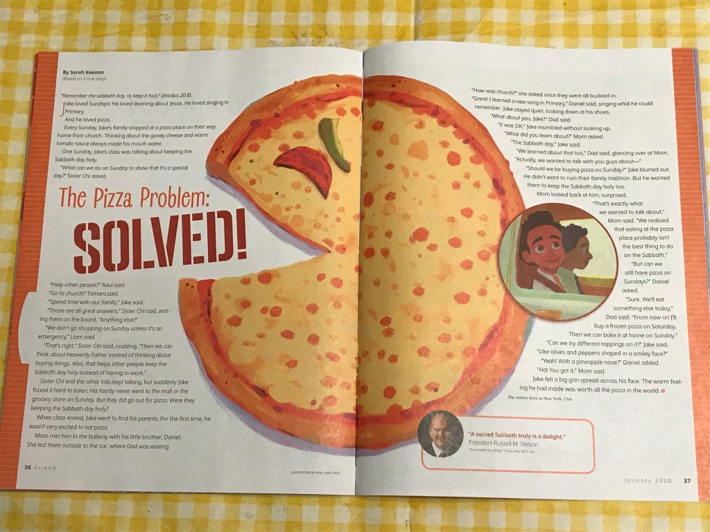
The issue is January 2020, that can be found on LDS.org, the article is written by Sarah Keenan. The page is found and published by The Church of Jesus Christ of Latter Day Saints, and is made to uplift and teach individuals the Gospel of Jesus Christ. The magazine that this is in is aimed towards children and in this particular article it talks about a nice lesson relating to pizza, with a giant pie found in the middle of the page!
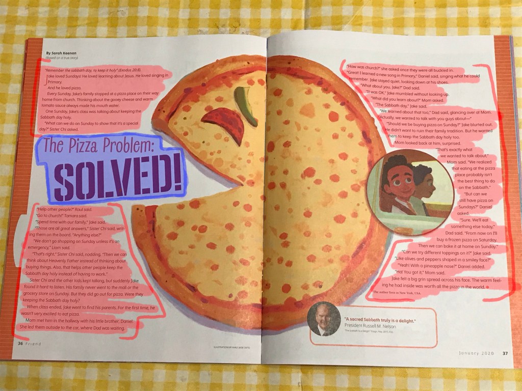
Typography Types
Here we have different types of fonts and their different sizes, so let me explain what they are. The small font used to write the entirety of this article is Neo-grotesque san serif font, a good choice as it is easy to read, it is more legible as a font. The giant font used for the Title of this article is Display font, and handwritting script. It is wide and a great font to use as it is suitable for headlines and titles. These fonts that were chosen were a good choice as it is easy on the eyes and clear and ledgible to read.
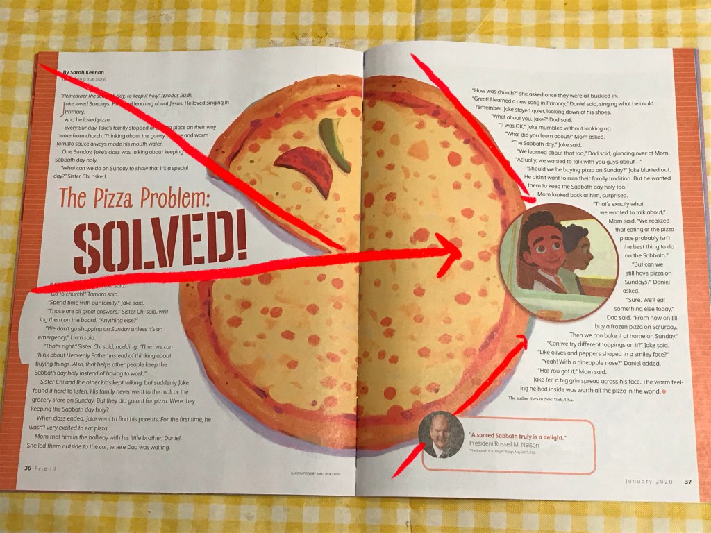
Leading Lines
Seeing as this article didn’t have specific photographs, they opted to use illustrations that are put in key locations to help guide its readers. I see a use in the leading lines principle, as the way the graphics are used have subtle lines that lead the readers attention to a certain point. As shown in the page above, you can see that lines in the pizza graphic, even the way the text is aligned, all point towards the circle with the child. while these graphics are minimal, they do indeed show this principle of leading lines.
